Amish America Gets A New Site Design
Earlier this week we launched a new site design. This is the first update in many years, and probably long overdue. To be frank, I usually never love when sites that I’m used to go and change their design.
But in this case, I think the changes should make the site more user-friendly – and I hope more pleasant for you, the readers. The previous design had a number of drawbacks which I hope the new version remedies.

First off, all the content is still here – some things just look a little different. So what’s new?
- For one, you should now see larger images on posts (desktop)
- The text should also appear a bit larger and easier to read
- Better related posts feature to find more interesting things to read
- More attractive site search
- And the overall design is a simpler two-column layout. This means less blank space when viewing on desktop
Additionally, for mobile users, the site should render better on various screen sizes, and thus be easier to use. Things like the logo and menu remain the same.
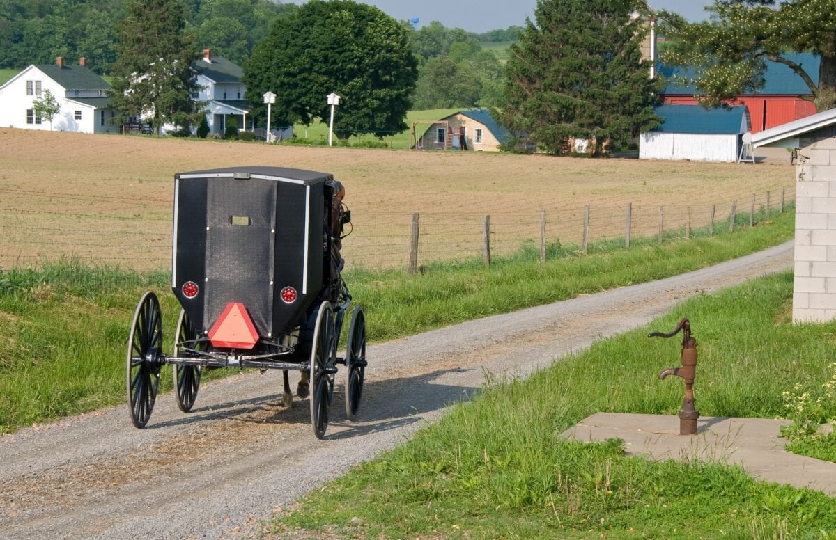
I’ll also be adding larger images to a lot of the previously-published posts, and making some other improvements to make it more user-friendly and easier to find things.
I’m still working on some tweaks and a few additions, so I hope you’ll bear with me. But I’d be glad to hear what you think, and your suggestions are welcome too.




Amish America
I grew up around Amish and Mennonite families. I don’t consider them any different than anybody else. They are just people as we are. I have a lot of friends that are Amish also Mennonite. But they are just people to me making a living taking care of their families and living life.
Site design
I noticed it right away & think it’s so much easier to view (on mobile) & much more updated looking. That’s a lot of work, it look great!
Thanks for the feedback Emily, I’m glad to hear it!
New Site Design
Hi Erik,
I like the updates you made. I primarily use my phone and found the site easy to navigate (especially appreciate the larger text..lol)
Great to hear, yes the text was on the small side, tried to find a sweet spot for readability and scrolling.
Looks much better
The new design looks so much better.
Thank you for all the work.
Regards from the UK.
Glad you think so Thomas, and always glad to from our readers in the UK and international locations!
It looks good!
I noticed it right away as well. I like it!
Awesome, happy to hear that Kal!
design
Hi Erik,
Loving the new design – much clearer and very easy to read, as well the larger photos don’t leave me peering at the screen trying to enlarge them 🙂 Oh the joys of getting older.
Blessings
Maxine (N.Z.)
That’s great to hear Maxine, I hear you, yes the photos really needed to be scaled up. On some parts of the site they’ll also appear larger on mobile view.
I'll get used to it
Hi Erik
I’m also the kind of person who doesn’t like changes, but after a while you get used to it.
But I have to admit, it’s true that the new format… Is not bad! 😉
Happy to hear that Romain, though yes I know what you mean!
Less ads
You have waaay to many ads The one “Amish Photo Shows too Much” why would you, who loves the Amish so much even show it. It is a Trick Ad to suck the unsuspecting in. It is offensive
Thanks John for letting me know about that. I agree I do not want that type of ad on the site, it’s not something I was aware of and nothing I’d approve. A range of ads are served automatically to each visitor by an ad company, who handle that part. I will reach out to them to figure out why that’s being shown, and stop it.
If you are able to take a screen shot of it and send it to me at ewesner[at]gmail[dot]com that would be great, though I’ll reach out to the ad company either way.
Easier to see
The new design is easier to zoom in on the column of text to see it better. It’s still too small otherwise for me. I love this website, everything about it.
Oops I didn't see the comments
I didn’t see that the comments have a colored background which makes it harder to read. Is the text black or dark gray? That would make a difference.
Thanks for bringing this to my attention Ann, I’ve put it on the list to look into. I think this can be tweaked.
Thanks Ann, do you mean the text still feels small?
Clean & Bright
Erik, thanks for taking the time and risk to improve your website design. It’s cleaner and brighter. With my old eyes I really do appreciate the larger type and photos.
Looking forward to more of your interesting writing.
Sincerely, Jim
I’m glad you found it easier to read Jim. Hope to make more improvements as I can.
Amish America gets a new site design
The new design is fresh and easier to navigate. Thank you for continuing to write the stories which bring back so memories of my childhood, growing up in an Amish community!
I’m happy to hear that Esther!
New Design
I really like the new design! I’m on the mobile version and it just seems to be easier to navigate and read. It was worth doing. 🙂